Web Design Fundamentals for Beginners

The world of web design can seem overwhelming when you're first starting out. With so many concepts, tools, and techniques to learn, it's hard to know where to begin. This guide will walk you through the essential fundamentals of web design that every beginner should understand.
Understanding the Basic Principles of Web Design
Before diving into the technical aspects of web design, it's important to understand the core principles that guide effective design decisions. These principles aren't just abstract concepts—they're practical guidelines that will help you create visually appealing and user-friendly websites.
1. Balance
Balance refers to the distribution of visual weight in a design. A balanced layout feels stable and harmonious, while an unbalanced design can create tension or highlight specific elements. There are two main types of balance:
- Symmetrical balance: Elements are evenly distributed on either side of a central axis.
- Asymmetrical balance: Different elements with varying visual weights are arranged to create equilibrium.
When designing web pages, consider how the various elements (text, images, white space) are distributed across the layout to create a sense of balance that guides the user's eye through the content.
2. Contrast
Contrast creates visual interest and helps users distinguish between different elements. It can be achieved through differences in:
- Color (light vs. dark)
- Size (large vs. small)
- Shape (round vs. angular)
- Texture (smooth vs. rough)
Effective use of contrast not only makes a design more engaging but also improves accessibility by ensuring text is readable and interactive elements are distinguishable.

3. Emphasis
Emphasis directs users' attention to the most important elements of your design. You can create emphasis through:
- Size (larger elements draw more attention)
- Color (bright or contrasting colors stand out)
- Position (elements in the center or at the top get noticed first)
- White space (surrounding an element with space makes it more prominent)
In web design, use emphasis to highlight calls-to-action, important information, or key messages you want visitors to remember.
4. Unity
Unity creates cohesiveness in your design, making all the separate elements feel like they belong together. This can be achieved through:
- Consistent color schemes
- Repeated visual elements or patterns
- Consistent typography
- Alignment of elements
A unified design feels complete and professional, enhancing the user's trust in your website.
Essential Elements of Web Design
Now that we've covered the basic principles, let's explore the key elements that make up web design.
1. Layout
The layout determines how content is structured and organized on a webpage. A well-planned layout enhances user experience by making content easy to find and consume.
Grid systems are an essential tool for creating organized layouts. They provide a framework that helps align elements consistently across your design. The most common grid system used today is the 12-column grid, which offers flexibility for different screen sizes.
When designing your layout, consider:
- Visual hierarchy (what users see first, second, third)
- Content prioritization (most important information should be prominent)
- White space (empty space that gives elements room to breathe)
- F-pattern and Z-pattern reading behavior (how users naturally scan web pages)
2. Color
Color is a powerful design element that affects mood, perception, and user behavior. When selecting colors for your website:
- Choose a color palette that reflects your brand identity
- Use the 60-30-10 rule (60% dominant color, 30% secondary color, 10% accent color)
- Ensure sufficient contrast for readability
- Consider color psychology (e.g., blue conveys trust, red creates urgency)
- Test your colors for accessibility (for users with color vision deficiencies)
Tools like Adobe Color, Coolors, and Color Hunt can help you create harmonious color schemes.
3. Typography
Typography plays a crucial role in both the aesthetics and usability of your website. Good typography makes content readable and sets the tone for your design.
Key typography considerations include:
- Font selection (choose fonts that reflect your brand personality)
- Font pairing (typically 2-3 complementary fonts)
- Hierarchy (different sizes and weights for headings, subheadings, body text)
- Line length (ideally 50-75 characters per line)
- Line spacing (1.5 times the font size is a good starting point)
- Responsive type (adjust font sizes for different devices)
Google Fonts and Adobe Fonts offer extensive libraries of web-safe fonts you can use in your designs.
4. Images and Graphics
Visual content enhances engagement and helps communicate your message more effectively than text alone. When using images and graphics:
- Choose high-quality, relevant images that support your content
- Optimize images for web (balance quality and file size)
- Consider using original photography or illustrations to stand out
- Maintain consistency in style across all visuals
- Include alternative text (alt text) for accessibility
Free stock photo sites like Unsplash, Pexels, and Pixabay can be good resources when you're starting out.
Responsive Design: A Must-Have Skill
With people accessing websites on various devices—from desktop computers to smartphones—responsive design has become essential. Responsive design ensures your website looks and functions well on all screen sizes.
Key aspects of responsive design include:
- Flexible grid layouts (that adapt to screen width)
- Responsive images (that scale or crop appropriately)
- Media queries (CSS rules that apply based on device characteristics)
- Mobile-first approach (designing for mobile screens first, then expanding for larger screens)
- Touch-friendly interfaces (larger tap targets for mobile users)
Frameworks like Bootstrap and Foundation can help beginners implement responsive designs more easily.

User Experience (UX) Basics
Good web design isn't just about aesthetics—it's about creating a positive experience for users. Understanding UX fundamentals will help you design websites that not only look good but also work well for users.
Consider these UX principles:
- Usability: How easy is your website to use and navigate?
- Accessibility: Can all users, including those with disabilities, use your website?
- Clarity: Is information presented clearly and logically?
- Consistency: Are patterns and behaviors consistent throughout the site?
- Feedback: Does the interface provide appropriate feedback for user actions?
Remember that the ultimate goal of web design is to solve problems for users, not just to create something visually appealing.
Getting Started with Web Design Tools
To put these principles into practice, you'll need to familiarize yourself with some essential web design tools:
Design Software
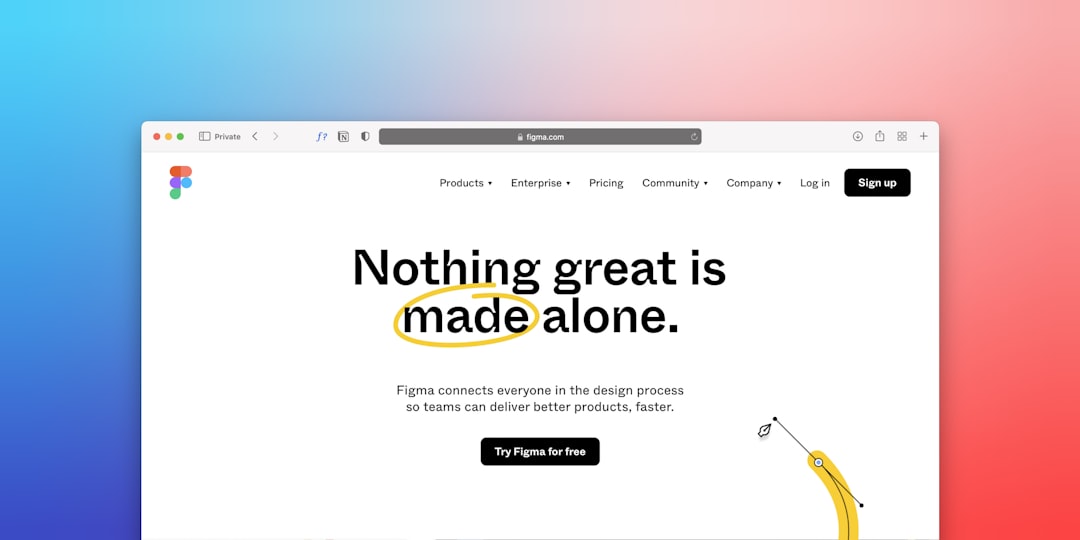
- Figma: A collaborative interface design tool that works in the browser
- Adobe XD: A vector-based tool for designing user experiences
- Sketch: A popular design tool for macOS
Front-End Development
- HTML: The markup language that structures web content
- CSS: The styling language that controls how content looks
- JavaScript: The programming language that adds interactivity
Learning Resources
- Online platforms like MDN Web Docs, W3Schools, and freeCodeCamp
- Video tutorials on YouTube and platforms like Udemy
- Community forums like Stack Overflow for troubleshooting
Conclusion: Practice Makes Perfect
Web design is a skill that improves with practice. Don't be discouraged if your first designs aren't perfect—everyone starts somewhere! Begin with small projects, seek feedback, and continue learning from both successes and mistakes.
Remember that good web design is about balance—between aesthetics and functionality, between creativity and usability, between your vision and your users' needs. By mastering the fundamentals outlined in this guide, you'll be well on your way to creating effective, engaging websites.
Ready to deepen your web design skills?
Check out our comprehensive Web Design Course that covers everything from these fundamentals to advanced techniques.
Explore Our Courses

Comments (5)
Michael Peterson
June 16, 2023This is exactly what I needed as a beginner! The explanations about balance and contrast really helped me understand why some of my designs weren't working. Thank you!
Sarah Jones
June 17, 2023Great article! I'd also recommend learning about CSS Flexbox as it's been a game-changer for me in creating responsive layouts. Any chance of a tutorial on that in the future?
David Kim
June 18, 2023I've been designing websites for clients without any formal training, and this article helped me understand why some of my instinctive choices were working. The section on typography was particularly useful!
Jessica Brown
June 20, 2023Question about color theory - do you have any recommendations for tools that can help with creating accessible color combinations? I want to make sure my designs are usable for everyone.
Emma Collins
June 20, 2023Hi Jessica! WebAIM's Contrast Checker and Adobe's Color Accessibility Tools are great for testing color combinations. Also, the Stark plugin for design tools helps evaluate accessibility right in your workflow. I'll add a section on accessibility tools to the article soon!
Alex Thompson
June 22, 2023I'm a developer trying to improve my design skills, and this was so helpful in breaking down the fundamentals. The practical tips on grid systems will definitely be implemented in my next project!
Leave a Comment