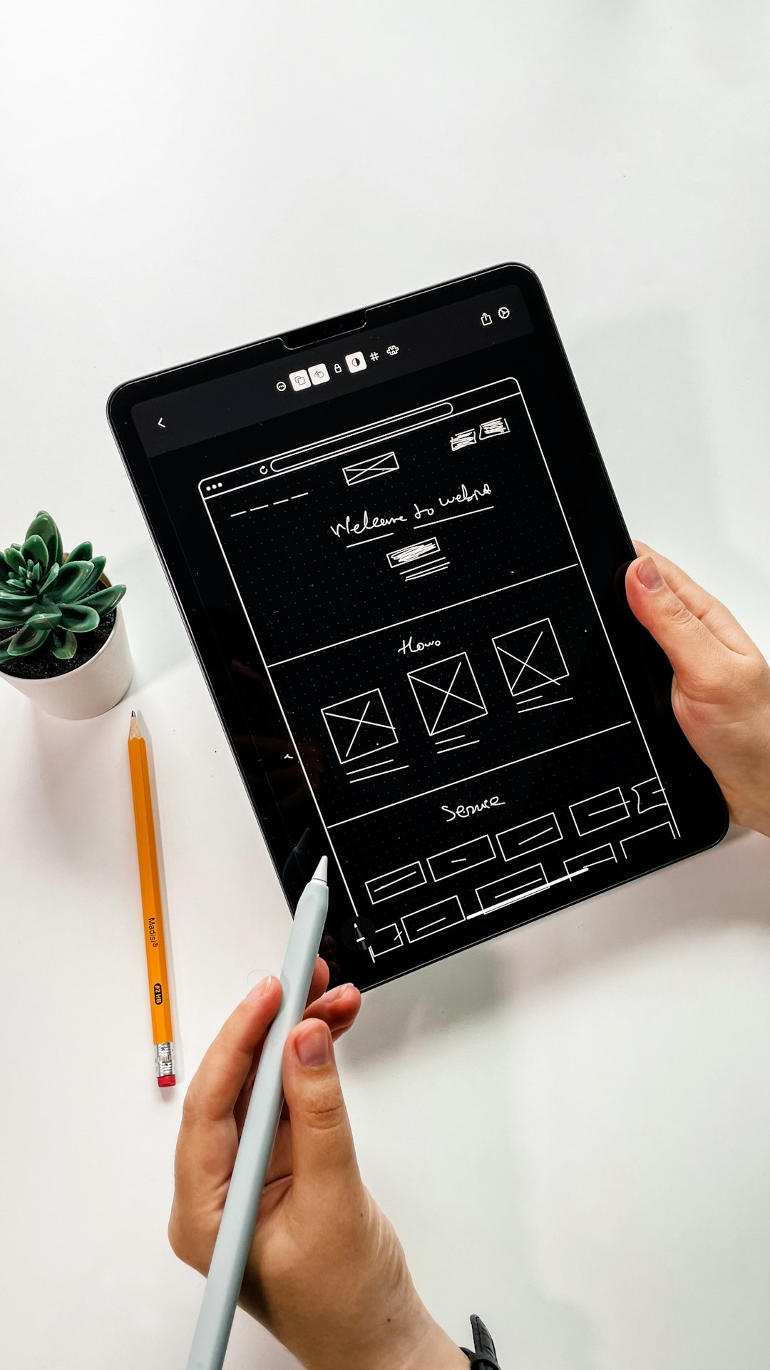
Mastering CSS Grid: A Comprehensive Tutorial

CSS Grid Layout has revolutionized how we build website layouts. Gone are the days of hacking our way through float-based layouts or struggling with complex positioning. Grid provides a powerful two-dimensional layout system that makes even the most complicated designs more manageable. In this comprehensive tutorial, we'll explore CSS Grid from basic concepts to advanced techniques, with practical examples you can use in your projects right away.
What is CSS Grid and Why Should You Use It?
CSS Grid Layout (or Grid) is a two-dimensional layout system specifically designed for the web. It allows you to organize content in rows and columns, and has many features that make building complex layouts straightforward and clean.
Key benefits of using CSS Grid include:
- True two-dimensional layouts: Unlike Flexbox (which is primarily one-dimensional), Grid allows you to control both rows and columns simultaneously
- More intuitive code: Grid lets you visualize and build layouts that directly reflect your design vision
- Simplified responsive design: With features like minmax() and auto-fill, creating responsive layouts requires less code
- Better content organization: Items can be placed precisely where you want them, regardless of their order in the HTML
- Reduced need for media queries: Many responsive behaviors can be built directly into the grid itself
Before we dive in, it's worth noting that CSS Grid is now supported in all modern browsers, making it a reliable choice for production websites.
CSS Grid Basics: The Fundamental Concepts
Let's start with the basic terminology and concepts you need to understand Grid:
Grid Container and Grid Items
A Grid Container is the element on which you apply display: grid. It's the direct parent of all the grid items.
Grid Items are the direct children of the grid container.
.container {
  display: grid;  /* This makes .container a grid container */
}

/* All direct children of .container become grid items */
Grid Lines, Tracks, Cells, and Areas

- Grid Lines: The horizontal and vertical dividing lines that make up the grid structure
- Grid Tracks: The space between two adjacent grid lines (rows or columns)
- Grid Cells: The intersection of a row and column
- Grid Areas: Rectangular spaces surrounded by four grid lines, which can span multiple cells
Creating Your First Grid
Let's create a simple 3×3 grid:
/* HTML */
<div class="grid-container">
  <div class="item">1</div>
  <div class="item">2</div>
  <div class="item">3</div>
  <div class="item">4</div>
  <div class="item">5</div>
  <div class="item">6</div>
  <div class="item">7</div>
  <div class="item">8</div>
  <div class="item">9</div>
</div>

/* CSS */
.grid-container {
  display: grid;
  grid-template-columns: 100px 100px 100px;
  grid-template-rows: 100px 100px 100px;
  gap: 10px;
}

.item {
  background-color: #e0e0e0;
  display: flex;
  justify-content: center;
  align-items: center;
  font-size: 24px;
}
In this example:
display: gridcreates a grid containergrid-template-columnsdefines three columns, each 100px widegrid-template-rowsdefines three rows, each 100px tallgap(formerlygrid-gap) sets a 10px space between grid items
Defining Grid Structure with Grid Template Properties
Now let's explore more ways to define your grid structure:
The fr Unit: Flexible Fractions
The fr unit represents a fraction of the available space. It's one of the most powerful features of Grid:
.grid-container {
  display: grid;
  grid-template-columns: 1fr 2fr 1fr;
  grid-template-rows: 100px 200px;
  gap: 10px;
}
In this example:
- The first column gets 1/4 of the available width
- The second column gets 2/4 (or 1/2) of the available width
- The third column gets 1/4 of the available width
This creates a flexible layout that adjusts based on the container size, similar to using percentage widths but with much cleaner math.
Repeat Function
For grids with many equally sized tracks, the repeat() function saves you from writing repetitive code:
/* Instead of writing: */
grid-template-columns: 1fr 1fr 1fr 1fr;

/* You can write: */
grid-template-columns: repeat(4, 1fr);
The repeat function takes two parameters: the number of repetitions and the track size.
minmax() Function
The minmax() function sets a minimum and maximum size for a track, which is incredibly useful for responsive designs:
.grid-container {
  display: grid;
  grid-template-columns: repeat(3, minmax(200px, 1fr));
  gap: 20px;
}
This creates three columns that are at least 200px wide but will expand equally to fill the available space if there's more than 600px (plus gaps) available.
auto-fill and auto-fit
These keywords allow you to create a flexible number of grid tracks based on the container size:
/* Create as many 200px columns as will fit */
.grid-container {
  display: grid;
  grid-template-columns: repeat(auto-fill, minmax(200px, 1fr));
  gap: 20px;
}
The difference between auto-fill and auto-fit becomes apparent when there's extra space:
auto-fillkeeps creating empty tracksauto-fitcollapses empty tracks and stretches the filled ones
Placing Items on the Grid
Once you've defined your grid structure, you can control where items are placed within it:
Grid Line-Based Placement
You can place items precisely using grid lines:
.item1 {
  grid-column-start: 1;
  grid-column-end: 3;
  grid-row-start: 1;
  grid-row-end: 2;
}

/* Shorthand: */
.item1 {
  grid-column: 1 / 3;
  grid-row: 1 / 2;
}

/* Even shorter: */
.item1 {
  grid-area: 1 / 1 / 2 / 3;  /* row-start / column-start / row-end / column-end */
}
Grid lines are numbered starting from 1, with negative numbers counting from the end (-1 is the last line).
Spanning Multiple Cells
You can also define placement by how many tracks an item should span:
.item1 {
  grid-column: 1 / span 2;  /* Start at line 1 and span 2 columns */
  grid-row: 1 / span 3;     /* Start at line 1 and span 3 rows */
}
Named Grid Areas
For more complex layouts, named areas provide a visual way to define your grid:
.grid-container {
  display: grid;
  grid-template-columns: repeat(3, 1fr);
  grid-template-rows: auto 1fr auto;
  grid-template-areas:
    "header header header"
    "sidebar content content"
    "footer footer footer";
  min-height: 100vh;
}

.header { grid-area: header; }
.sidebar { grid-area: sidebar; }
.content { grid-area: content; }
.footer { grid-area: footer; }
This creates a common website layout with a header, footer, sidebar, and main content area. The ASCII-art style definition in grid-template-areas makes it easy to visualize the layout.

Alignment in CSS Grid
CSS Grid provides powerful alignment capabilities for both the grid container and individual items:
Aligning Grid Tracks
These properties distribute extra space within the grid container:
justify-content: Aligns grid tracks along the inline (row) axisalign-content: Aligns grid tracks along the block (column) axis
.grid-container {
  display: grid;
  grid-template-columns: repeat(3, 100px);
  grid-template-rows: repeat(2, 100px);
  justify-content: center;      /* Centers the grid horizontally */
  align-content: space-between; /* Distributes rows with space between */
  height: 500px;                /* Container needs a height for align-content to work */
}
Possible values include: start, end, center, stretch, space-around, space-between, and space-evenly.
Aligning Grid Items
These properties control the alignment of items within their grid cells:
justify-items: Aligns items along the inline (row) axisalign-items: Aligns items along the block (column) axis
.grid-container {
  display: grid;
  grid-template-columns: repeat(3, 1fr);
  grid-template-rows: repeat(2, 100px);
  justify-items: center;  /* Centers all items horizontally */
  align-items: end;       /* Aligns all items to the bottom of their cells */
}

/* For individual items: */
.item1 {
  justify-self: start;    /* Overrides justify-items for this specific item */
  align-self: center;     /* Overrides align-items for this specific item */
}
Possible values include: start, end, center, and stretch (default).
Advanced CSS Grid Techniques
Now that we've covered the basics, let's explore some more advanced techniques:
Auto Placement and the grid-auto Properties
CSS Grid has a powerful auto-placement algorithm that determines where items should go if you don't explicitly place them. You can control aspects of this behavior:
.grid-container {
  display: grid;
  grid-template-columns: repeat(3, 1fr);
  grid-auto-rows: minmax(100px, auto);  /* Sets size for implicitly created rows */
  grid-auto-flow: dense;                /* Controls how auto-placement works */
}
The grid-auto-flow property can be:
row(default): Fill each row in turncolumn: Fill each column in turndense: Attempt to fill holes earlier in the grid
Overlapping Grid Items
Unlike traditional layouts, Grid allows items to overlap, which can create interesting design effects:
.item1 {
  grid-column: 1 / 3;
  grid-row: 1 / 3;
  z-index: 1;  /* Controls stacking order for overlapping items */
}

.item2 {
  grid-column: 2 / 4;
  grid-row: 2 / 4;
}
In this example, item1 and item2 will overlap in the cell at column 2, row 2. The z-index property controls which one appears on top.
Nested Grids
Grid containers can be nested inside grid items to create complex layouts:
.grid-container {
  display: grid;
  grid-template-columns: repeat(3, 1fr);
  gap: 20px;
}

.item {
  display: grid;               /* The item itself becomes a grid container */
  grid-template-columns: 1fr 1fr;
  grid-template-rows: auto 1fr;
  gap: 10px;
}
Subgrid (Emerging Feature)
Subgrid is a newer feature (not yet supported in all browsers) that allows a grid item to inherit the grid definition of its parent:
.grid-container {
  display: grid;
  grid-template-columns: repeat(9, 1fr);
  gap: 10px;
}

.item {
  grid-column: 2 / 8;
  display: grid;
  grid-template-columns: subgrid;  /* Inherit the parent's column tracks */
}
This is particularly useful for maintaining consistent alignment across complex nested structures.
Practical CSS Grid Examples
Let's explore some common layout patterns you can create with CSS Grid:
Example 1: Holy Grail Layout
The classic "holy grail" layout with header, footer, main content, and two sidebars:
.grid-container {
  display: grid;
  grid-template-areas:
    "header header header"
    "nav main aside"
    "footer footer footer";
  grid-template-columns: 200px 1fr 200px;
  grid-template-rows: auto 1fr auto;
  min-height: 100vh;
}

header { grid-area: header; }
nav { grid-area: nav; }
main { grid-area: main; }
aside { grid-area: aside; }
footer { grid-area: footer; }

/* Responsive version */
@media (max-width: 768px) {
  .grid-container {
    grid-template-areas:
      "header"
      "nav"
      "main"
      "aside"
      "footer";
    grid-template-columns: 1fr;
  }
}
Example 2: Image Gallery
A responsive image gallery with varying image sizes:
.gallery {
  display: grid;
  grid-template-columns: repeat(auto-fill, minmax(250px, 1fr));
  grid-auto-rows: 250px;
  gap: 20px;
}

.gallery-item {
  overflow: hidden;
}

.gallery-item img {
  width: 100%;
  height: 100%;
  object-fit: cover;
}

/* Featured images */
.gallery-item.featured {
  grid-row: span 2;
  grid-column: span 2;
}
Example 3: Card Layout with Auto-Placement
A flexible card layout that automatically adjusts based on available space:
.card-grid {
  display: grid;
  grid-template-columns: repeat(auto-fit, minmax(300px, 1fr));
  gap: 30px;
}

.card {
  display: grid;
  grid-template-rows: auto 1fr auto;
  border-radius: 8px;
  overflow: hidden;
  box-shadow: 0 2px 10px rgba(0, 0, 0, 0.1);
}

.card-header img {
  width: 100%;
  height: 200px;
  object-fit: cover;
}

.card-body {
  padding: 20px;
}

.card-footer {
  padding: 15px 20px;
  background-color: #f8f9fa;
}
Browser Support and Fallbacks
CSS Grid is now supported in all modern browsers. However, if you need to support older browsers like Internet Explorer, you should implement fallbacks:
/* Fallback for older browsers */
.container {
  display: flex;
  flex-wrap: wrap;
}

.item {
  flex: 1 1 300px;
  margin: 10px;
}

/* Modern Grid layout */
@supports (display: grid) {
  .container {
    display: grid;
    grid-template-columns: repeat(auto-fill, minmax(300px, 1fr));
    gap: 20px;
  }

  .item {
    margin: 0;  /* Remove margin as gap handles spacing */
  }
}
The @supports rule allows you to apply CSS only if the browser supports a specific feature.
Conclusion: Embracing the Power of CSS Grid
CSS Grid has transformed how we approach web layout. Its intuitive, powerful, and flexible nature makes it suitable for everything from simple components to complex page structures.
Key takeaways from this tutorial:
- CSS Grid is a two-dimensional layout system that handles both rows and columns
- The
frunit,minmax(), andauto-fill/auto-fitprovide powerful responsive capabilities - Explicit item placement gives you precise control over your layout
- Named grid areas offer a visual way to define complex structures
- Advanced features like alignment, auto-placement, and nesting allow for sophisticated designs
As you continue to explore CSS Grid, remember that the best way to learn is by building real projects. Start simple and gradually incorporate more advanced techniques as you become comfortable with the basics.
Ready to become a CSS Grid master?
Check out our comprehensive Web Design Course that covers CSS Grid and many other modern web development techniques.
Explore Our Courses


Comments (2)
Thomas Webb
August 6, 2023This is exactly what I've been looking for! I've been struggling with Flexbox for some complex layouts and this makes so much more sense for what I'm trying to achieve. The examples are really clear and I appreciate the browser support section too.
David Martinez
August 6, 2023Glad it helped, Thomas! Flexbox is still great for one-dimensional layouts (like navigation menus), but Grid really shines for complex two-dimensional structures. Let me know if you have any specific questions as you implement it in your projects.
Anjali Patel
August 8, 2023Great tutorial! I have a question about grid-template-areas - is there a limit to how many unique area names you can have in a grid? Also, do you have any tips for debugging grid layouts? Sometimes it's hard to visualize what's happening when things don't align as expected.
Leave a Comment