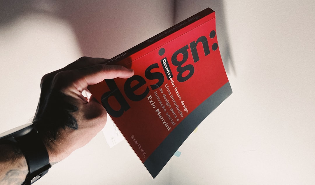
10 UI/UX Design Principles Every Designer Should Know

Creating intuitive, engaging, and effective user interfaces is both an art and a science. While creativity is essential, understanding and applying fundamental UI/UX design principles is what separates great designs from merely good ones. In this article, we'll explore 10 essential principles that will elevate your design work and create better experiences for your users.
Why Design Principles Matter
Design principles aren't arbitrary rules—they're guidelines based on how humans perceive, process information, and interact with digital interfaces. They're grounded in psychology, cognitive science, and years of practical observation.
By following these principles, you can:
- Create more intuitive interfaces that users can understand immediately
- Reduce cognitive load and user frustration
- Increase engagement and conversion rates
- Build more coherent and professional digital products
- Solve design problems more efficiently
Let's dive into the 10 principles that should inform every UI/UX design decision you make.
1. Consistency
Consistency is perhaps the most fundamental principle in UI/UX design. Users learn how your interface works as they interact with it, and they expect similar elements to behave in similar ways throughout their experience.

There are several types of consistency to consider:
- Visual consistency: Using the same colors, typography, icons, and spacing for similar elements
- Functional consistency: Ensuring that interactive elements work the same way throughout the interface
- Internal consistency: Maintaining consistency within your product
- External consistency: Following established patterns that users are familiar with from other products
How to apply it: Create and maintain a design system with reusable components, establish clear patterns for interactions, and follow platform conventions when appropriate.
2. Hierarchy
Visual hierarchy guides users through content by establishing what's most important and creating a clear path for their eyes to follow. It helps users understand the relationship between elements and find what they're looking for quickly.
Effective hierarchy can be established through:
- Size (larger elements appear more important)
- Color and contrast (high-contrast elements stand out)
- Spacing (elements with more space around them gain prominence)
- Typography (variation in font weight, size, and style)
- Position (elements at the top or center often seem more important)
How to apply it: Define the relative importance of each element on a screen, then use visual cues to reflect that hierarchy. Make sure the most important actions and information are the most prominent.
3. Clarity
Users should never have to wonder what an element does or how to accomplish a task. Clarity in design means creating interfaces that are self-explanatory and transparent in their function.

Aspects of clarity include:
- Clear labeling of interactive elements
- Intuitive icons paired with text when necessary
- Explicit feedback for actions
- Straightforward navigation
- Concise and useful error messages
How to apply it: Always ask yourself if a first-time user would understand how to use your interface. Use plain language, provide visible cues for interactive elements, and ensure that the purpose of each screen is immediately clear.
4. Feedback
Feedback acknowledges users' actions and keeps them informed about what's happening in the system. It creates a sense of control and prevents uncertainty about whether an action was successful.
Effective feedback can be:
- Visual: Color changes, animations, progress indicators
- Tactile: Vibrations on mobile devices
- Auditory: Sounds indicating success or error
Feedback should be provided for:
- Button presses and other interactions
- Form submissions
- Loading processes
- Errors and success states
- System status changes
How to apply it: Design appropriate feedback for every user interaction. For minor actions, subtle feedback is sufficient; for major actions like purchases or deletions, provide more substantial feedback.
5. Accessibility
Accessible design ensures that your product can be used by as many people as possible, including those with disabilities. It's not just a nice-to-have—it's a fundamental aspect of good design and often a legal requirement.
Key accessibility considerations include:
- Sufficient color contrast for text readability
- Support for screen readers and other assistive technologies
- Keyboard navigation for those who can't use a mouse
- Text alternatives for images
- Resizable text without loss of functionality
- Clear focus indicators for interactive elements
How to apply it: Familiarize yourself with the Web Content Accessibility Guidelines (WCAG), use accessibility checkers, and test with actual assistive technologies. Consider accessibility from the start of your design process, not as an afterthought.
6. User Control
Users should feel in control of their experience with your product. This means providing clear options, allowing them to undo actions, and respecting their choices.

Elements of user control include:
- Clearly marked exits from processes
- Ability to undo actions
- Confirmation for destructive or irreversible actions
- Customization options where appropriate
- Respect for user preferences and settings
How to apply it: Design with reversibility in mind. Consider what might go wrong during user interactions and provide escape routes. Ask for confirmation before major actions, and allow users to customize their experience when possible.
7. Recognition Over Recall
This principle comes from cognitive psychology—it's easier for humans to recognize things they've seen before than to recall them from memory. Good interfaces minimize the need for users to remember information from one part of the process to another.
Ways to apply this principle:
- Use visible, recognizable icons and controls
- Provide suggestions and autocomplete in search fields
- Use dropdown menus instead of requiring text entry
- Show recently used items
- Maintain context when users navigate between screens
How to apply it: Make options visible and accessible. Don't hide important features in obscure places. Use familiar patterns and provide visual cues that help users understand what's available without having to remember commands or navigation paths.
8. Efficiency and Flexibility
A well-designed interface should cater to both novice and expert users. It should be easy to learn for beginners while providing shortcuts and efficiencies for experienced users.
Balancing efficiency and flexibility includes:
- Providing clear paths for common tasks
- Including keyboard shortcuts for power users
- Allowing customization of workflows
- Designing accelerators (like swipe gestures on mobile)
- Enabling task completion with minimal steps
How to apply it: Map out the most common user journeys and optimize them. Then add shortcuts and advanced features for power users without cluttering the interface for beginners. Consider progressive disclosure, where advanced options are revealed as users become more experienced.
9. Error Prevention and Recovery
Even with the best design, users will make mistakes. A good interface works to prevent errors before they happen and helps users recover when they do occur.
Error prevention strategies include:
- Input validation as users type
- Clear labels and instructions
- Confirmation for irreversible actions
- Disabling options that aren't currently valid
- Providing defaults and examples
For error recovery:
- Clear error messages that explain what went wrong
- Constructive suggestions for fixing the problem
- Maintaining entered data when errors occur
- Providing undo functionality

How to apply it: Anticipate common errors and design to prevent them. When errors do occur, provide helpful, human-friendly error messages that guide users toward solutions rather than just pointing out mistakes.
10. Aesthetic and Minimalist Design
An interface should contain only the elements necessary for current tasks, presented in a visually pleasing way. Excess features or decorative elements can distract users and make interfaces harder to use.
Principles of aesthetic and minimalist design:
- Remove unnecessary elements
- Use visual elements with purpose, not just decoration
- Prioritize content over chrome (interface elements)
- Use white space effectively to create focus and separation
- Create visual harmony through alignment, proportion, and balance
How to apply it: Regularly audit your designs to eliminate unnecessary elements. For each component, ask whether it serves a functional purpose and whether it could be simplified. Use visual design to enhance usability, not to showcase design skills at the expense of functionality.
Putting It All Together: The Holistic Approach
While we've discussed these principles individually, great UI/UX design comes from applying them holistically. Sometimes principles will need to be balanced against each other—for example, adding more user control might come at the expense of simplicity.
The key is to understand the underlying goals of each principle and make informed decisions about how to apply them in specific contexts:
- Understand your users: Their goals, contexts, preferences, and limitations should guide which principles to prioritize
- Define clear objectives: What is the primary purpose of this screen or feature?
- Test with real users: Principles are guides, not absolutes—observe how real people interact with your designs
- Iterate: Apply principles, test, learn, and refine
Conclusion: Principles as a Foundation, Not a Formula
These 10 principles provide a strong foundation for creating effective UI/UX designs, but they're not a formula for automatic success. Great design requires applying these principles thoughtfully in the context of specific users, tasks, and environments.
The most successful designers understand both the what and the why behind these principles. They know when to adhere strictly to a principle and when to bend it for the sake of a better overall experience.
As you develop your design skills, continually revisit these principles, but also develop your own sense of what makes an interface work well for its intended purpose and audience. The true art of UI/UX design lies in that balance between principles and intuition, rules and creativity.
Want to master UI/UX design principles?
Take your skills to the next level with our comprehensive UI/UX Design Masterclass. Learn to apply these principles and more in real-world projects.
Explore Our Courses


Comments (3)
Rebecca Chen
July 4, 2023This is such a comprehensive overview! I particularly appreciate the section on accessibility - it's often overlooked but so crucial. Would love to see a follow-up article with examples of these principles in real-world applications.
Marcus Williams
July 5, 2023I've been designing interfaces for 5 years and still found value in this refresher. The point about balancing different principles is spot on - sometimes you have to make trade-offs, and knowing which principles to prioritize in different contexts comes with experience.
Sarah Kim
July 5, 2023Thanks for your comment, Marcus! You're absolutely right about the importance of trade-offs. Even experienced designers face these challenges daily. Would you be interested in an article specifically about making these design trade-offs?
Elena Kowalski
July 8, 2023Great article! Question about the "Recognition Over Recall" principle - do you think this sometimes conflicts with minimalist design? I find myself struggling to balance keeping interfaces clean while also making functionality obvious.
Leave a Comment